

24 March 2023
The three-part documentary series “Dawn of the Dolphins” is a Stan Original produced by Onion TV, in association with Screen Queensland. It follows legendary coach Wayne Bennett as he prepares the Queensland-based Dolphins for their inaugural NRL season.
During the remote creative brief session, director Nick Piper nutted out the guts of the story – a behind the scenes look at the creation of a club, hard work/determination of the team and their journey to become a unified, strong club. Nick also mentioned the brand colours of white, sand and red. This documentary wasn’t to be a ‘brand film’ but it was just something to keep in mind.
The documentary was to be a mixture of fly-on-the-wall observational style camerawork, set-up interviews, bold graphics and high-intensity game footage. After talking through everything, Nick was comfortable and happy to give senior colourist Angela Cerasi the freedom to bring all the elements together in the way she saw best fit.
Angela jumped at the freedom to bring her creativity to the table! She did flag however that it was important for Nick to view the first 2 minutes of the grade and approve it, before she went ahead with the rest of the film. Together with Post Producer Rob Sarroff, they decided the SDR grade should be the primary format, and then an HDR trim pass happened afterwards.
Angela created a suite of looks which included; interviews, team training, meeting rooms/office, exterior Redcliffe, exterior UK and rugby league footage.
Overall she felt the visual look should be strong and confident, with the scope to be playful! She took this cue from the content of the story but also from the bold editing (including upside down shots) and music composition (dramatic, adventurous and sometimes lighthearted).
Her general rationale was:
- Keep interviews natural, bringing out the human quality (ie. not too cold and sterile)
- Add a point of difference to the team training by giving it a unique visual style – different to standard ob-doc actuality
- Add interest to the beige meeting rooms by giving them more colour
- UK – cold and desat (cliched but true!)
- Redcliffe – sunny, bright
- Rugby League game footage – tough, rough, bold, strong, powerful
Wayne Bennett is a notoriously private and matter-of-fact man who ordinarily refrains from personal interviews. An introvert who could be viewed as stony and serious. Nick was able to capture Wayne in a standard well-lit, mid-shot interview set up.
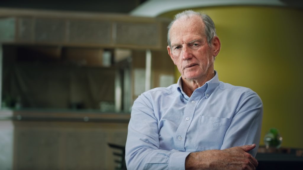
Angela wanted to ensure these interviews felt warm and natural, to bring out the human quality and ensure it didn’t feel like an inquisition. She did this by warming skin tones, softening the background, sharpening Wayne’s eyes so we could really see into them. Angela de-saturated the yellow in the background so it wasn’t too bold. She framed the image with a soft vignette to draw our eye to the character (and make it more filmic, as opposed to post-match interviews which wouldn’t have this same shaping of light).
Similar tweaks were also used throughout the series to help bring out the human quality of the interviews. A way that Angela unified the interviews (some were able to be set up more than others – such is documentary filmmaking!) was to really darken the outside of the frame, and bring in some coolness. This gave the effect of the character being warmer (without having to actually over warm their skin tones).
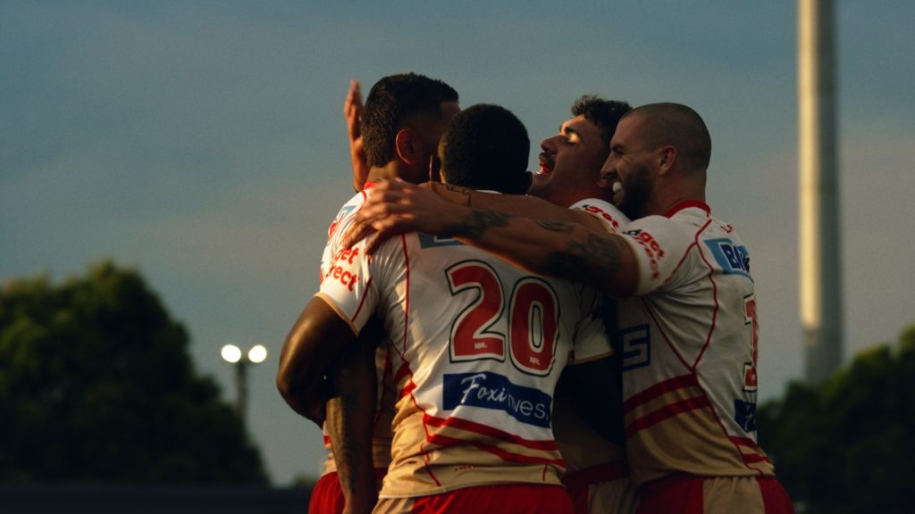
Angela is a true believer that no matter what the documentary subject, and how heavy the grade style, skin tones are an element which must be isolated and treated with the utmost care – this means we identify with them, and they sit in our world – no matter what the rest of the frame is doing! The most dramatic look was probably the rugby league sequences.
Angela made these cinematic and gritty by cranking the contrast, adding grain and crushing blacks. Colours were strong and any skies were enhanced to create an epic feel.
This look builds up to the finale in Episode 3, the Dolphins first ever NRL game against the Sydney Roosters. The Dolphins brand colours of red and sand are saturated and whites and blacks are clean and strong. In this scene, for the only time in the series, Angela carried across the rugby match look to the intercutting shots of the fans too – increasing the sense of drama and uniting the team, the players, the coach, the trainers and the fans as one.
Job done!
You might also enjoy 5 Ways Colour Grading Can Enhance A Story and 5 Ways To Get the Best Out of Your Colour Grading Session.