1st February 2023
Difference Between Colour Grading Stills and Motion Picture video
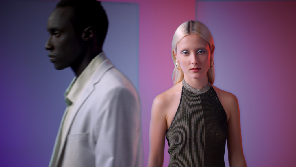
There is a big difference between colour grading motion picture/ video versus still photographs. Still photography is really just an entirely different beast to motion picture. Often with a commercial, there is an advertising campaign going out and so there may also be print versions of the ad going out too. Sometimes we will be given the print version as a visual reference.
Obviously by processing photographs in Photoshop or Lightroom you are also looking at saturation, contrast, luminance, where the whites are sitting, the blacks, and doing clean up work. But it’s 2D. With moving pictures you have depth to deal with, moving light and shadows, moving actors, moving camera, moving texture though the way of grain or noise.
You might have to grade the start of a shot differently to the end of a shot. And then, you have the factor of how the shots sit together in the film. A still photograph is a stand alone image. We have 25 images per second which makes up a shot, and then many shots lined up next to each other. You have to factor in colour perception.
For example, in a commercial you might have a series of cool blue establishing shots, followed by a hero shot of a cream wall with a character in the centre. All of a sudden that cream wall feels completely overly warm because of its placement in the edit next to the cooler shots. We might need to compensate by cooling off the cream wall in this instance so it’s not so jarring. If we were directly trying to match the cream wall with the reference of the print version, we could do that, but in the context of a film edit, it will not feel right because of colour perception.
Examples of the print campaign


For an in-depth case study on this topic, see our blog discussing the LG X Harvey Norman TVC Colour Grade. See 5 examples on how colour grading can enhance a story on Peachy Founder Angela Cerasi’s blog here.


 Prev
Prev