

4th March 2024
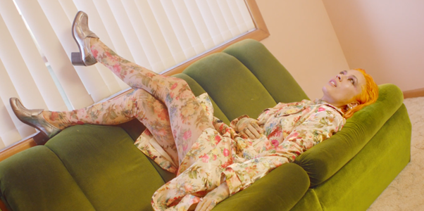
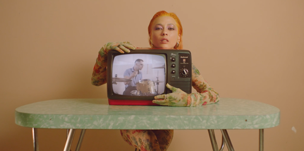
Children Collide’s music video for “Trampoline”, colour graded by Peachy
Creating Nostalgia Through Colour Grading
In the colourful world of film, where stories unfold and feelings arise, there’s an often overlooked but powerful element: colour grading. Can colour really make you feel a certain way? Can it connect you with a memory? Yes! Let’s examine how colour is used as a device to evoke nostalgia, stir up memories, enrich storytelling, and keep your eyes peeled to the screen.
Setting the Emotional Stage: The Impact of Colour Grading in Film
Colour possesses the amazing ability to stir emotions and bring back your core memories. Picture this: a cosy, candlelit room in soft warm light, conjuring a sense of intimacy and relaxation. Psychologically, specific hues can forge a sentimental link, whisking viewers away to times of happiness or sadness. By carefully grading colours, filmmakers can control these emotions, leading audiences through a journey of feelings.
The Psychology Behind Colour
Digging deeper into the psychology of colour, we can uncover the intricacies of its impact on human emotions. Warm tones, such as reds and oranges, evoke feelings of warmth, passion, and energy. Cool tones, like blues and greens, convey calmness, tranquillity, and melancholy. Understanding these nuances allows colourists to craft visual experiences that resonate deeply with audiences. It’s a bit crazy how easily we’re drawn in by these techniques!
Colour Grading: A Tool for Storytelling
Colour grading serves as an important device for storytelling, allowing filmmakers to infuse their narratives with layers of meaning and emotion. By establishing unique colour palettes for various time periods or settings, filmmakers can engage viewers in the narrative universe. Have you ever noticed how dream sequences and flashbacks have a subtle colour shift? This device helps to define the boundaries between reality and imagination.
Crafting Atmosphere Through Colour Palettes
Atmosphere is another area where colour grading shines. Vintage colour palettes evoke a sense of nostalgia, recalling bygone eras and simpler times. Sepia tones infuse scenes with a timeless air, reminiscent of old photographs. Analogue film aesthetics add texture and depth, creating a tangible quality to the cinematic experience. Through careful attention to detail, colourists transform ordinary images into immersive worlds filled with atmosphere and emotion.
The Collaborative Process: Working with Filmmakers
Collaboration lies at the heart of successful colour grading. By working closely with filmmakers, colourists gain insight into the directorial vision, ensuring that every hue aligns with the overarching narrative. Balancing artistic expression with the demands of the story requires finesse and skill, as colourists strive to strike the perfect chord between visual spectacle and emotional resonance.
Peachy Case Study: “Trampoline”
The cinematic and retro stylised music video for the song “Trampoline,” by Children Collide illustrates the seamless collaboration process in crafting a strong nostalgic vibe.
From directing and production design to lighting and the William Eggleston-inspired composition, every aspect harmonises to evoke an authentic nostalgic aesthetic. Incorporating very low contrast, filmic grain, reds in the shadows and a generally warm colour grade effectively captures the nostalgic essence of the house scenes.
The video was described in the press release as an “avant-garde technicolour suburban dream,” and we couldn’t agree more.
In essence, colour is a fundamental element in drawing out the nostalgic vibe in a video. It sets the mood, and has significant power in making audiences feel and connect to the narrative in the intended way.
Children Collide’s music video for “Trampoline”, colour graded by Peachy
Check out Peachy Founder Angela Cerasi’s article about texture in colour grading, originally written for the Australian Cinematographer Magazine, AC Mag.
Peachy is Australia’s leading film and TV colour grading studio for commercials, documentary and scripted narrative drama. We are dedicated to forming meaningful connections with your story and evoking the intended emotions from audiences through colour, in line with your directorial vision. We’d love to chat about your project and collaborate with you to bring out the nostalgic feel in your videos!