

21 September 2023
How to Grade in Black and White
Do black and white films take the same amount of time to colour grade as a full colour film? Do they really need colour grading at all?
Senior Colourist Angela Cerasi’s answer: “Yes!”
When you are colour grading a film, the ‘colour’ is actually only one element of the process. Some of the other elements a colourist will deal with is brightness/luminance, contrast, shaping/cutting light and creating the appearance of more depth, drawing attention to different parts of the frame by shading, highlighting, blurring. The colourist will also be looking at texture – grain, noise, sharpness/softness. They also have to make each shot cohesive with the previous and next shot; cohesive within the scene and within the film. Making a shot flow to the next (or jolt to the next, if that is the intention).
With the absence of colour, it can be argued that these other elements become even more important. You have to create depth, focus and a dynamic image without the bonus of a colour palette to help you. Grading black and white motion picture footage most certainly does take as long as colour and you can get some absolutely stunning images when you simplify an image down to black, white and all of the tones in between.
Some examples:
1. High Contrast Look
This look has stark whites, strong blacks and not much range in the middle for variations of grey. High contrast black and white is striking, dynamic and bold. Examples would be noir films, thrillers, scenes/films where there are two strong conflicting elements.. such as good vs. evil.
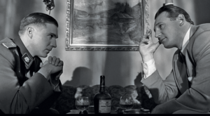
Image from the film Schindler’s List, directed by Steven Spielberg
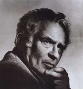
Black and White portrait of Norman Mailer by photographer Irving Penn from 1984
2. Soft Look
In this context “soft” does not refer to focus. Images with a soft look can be sharp but may have elevated blacks (blacks not sitting as true black but raised up to a shade of grey), no “crushing” (so there is detail in the shadows) and soft highlights (the whites are not jarring, they roll off beautifully). Often you need to shoot when it’s cloudy to get this look, or at least fill in the shadows with reflectors or fill light. In the colour grade you can soften the contrast and pull up shadow detail but in order to achieve this clean look, the exposure needs to be bang on. Arguably this soft look is not very realistic – in the sunny outdoors there would be way more contrast and shadows are dark. I guess this is the beauty of great colour grading, it can look very natural even when it has been played around with quite dramatically.
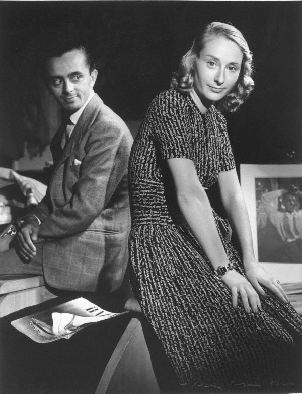
1936 black and White photo of “Mr & Mrs Larry Adler” by photographer Max Dupain
Example of a soft black and white colour grade
1960 black and white untitled photo by Queensland photographer Max Dupain
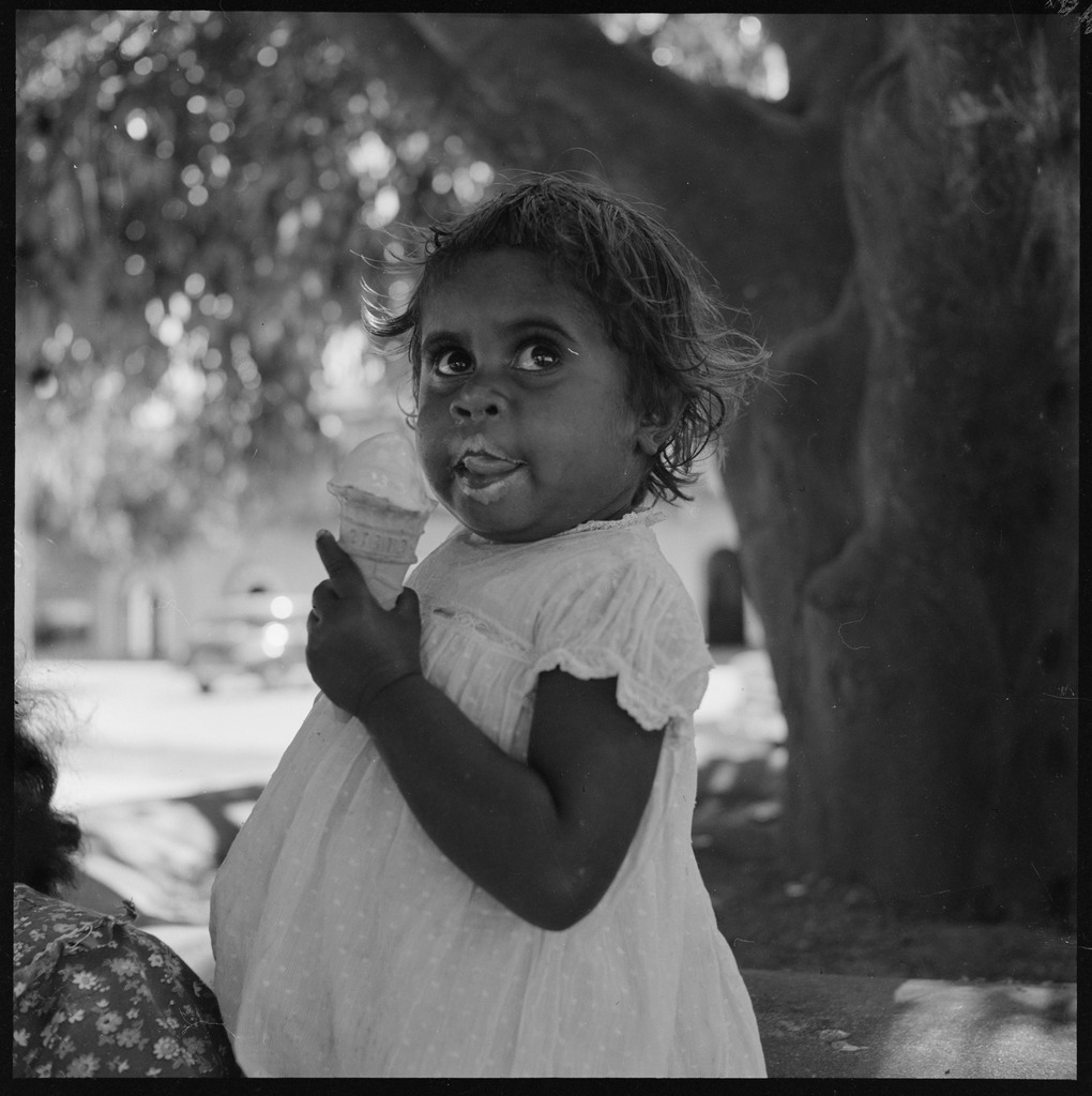
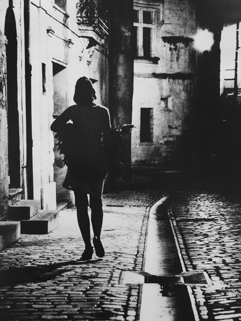
3. Dark low contrast
The difference between the brightest and darkest parts is not very contrasted. The film sits in the low range of the luminance spectrum. It can feel mysterious, not clear, dark and moody. The shadows are a real feature and it can feel like a character is coming out of the darkness, going into the darkness, or something ominous is about to happen.
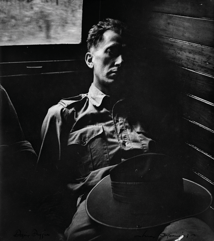
Black and white photograph by Australian photographer Max Dupain: “The dozing soldier” from 1943
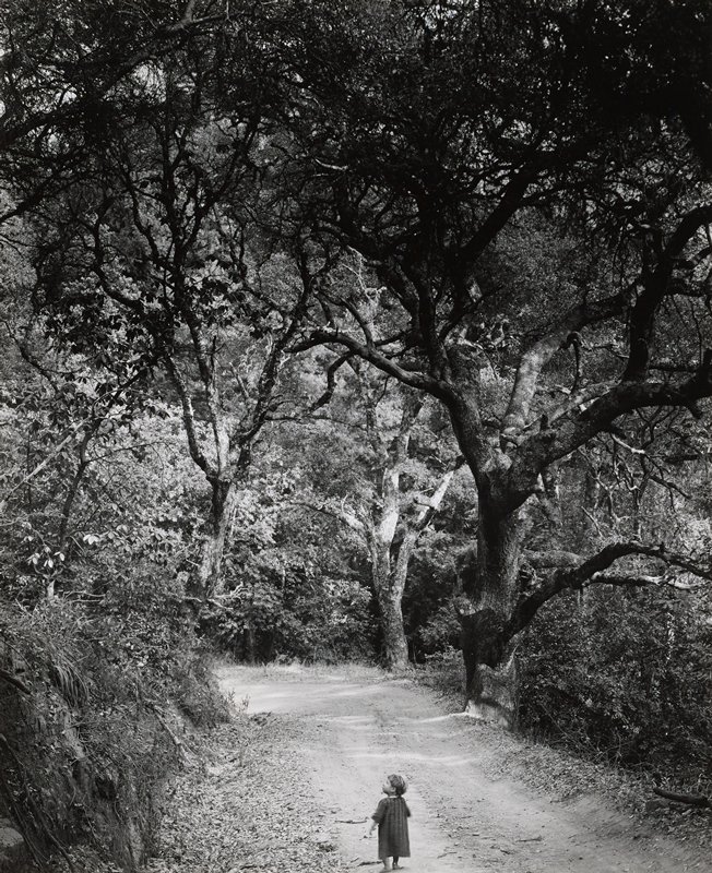
Wynn Bullock’s 1958 photograph “Child on Forest Road” – an example of dark/low contrast black and white grading
4. Black and White With A Tint
Monochrome with a cast/wash of another colour. This can be subtle or obvious. Sepia fits into this category and can be used as a nod to a vintage era, a nostalgic time. Can also have one element with some colour in it to signify a motif ie. the red coat in Schindler’s List. I have colour graded entire documentaries with the black and white archive elements all with a subtle cool tint – if the subject matter calls for it, it can just really give the archive a unique feel.
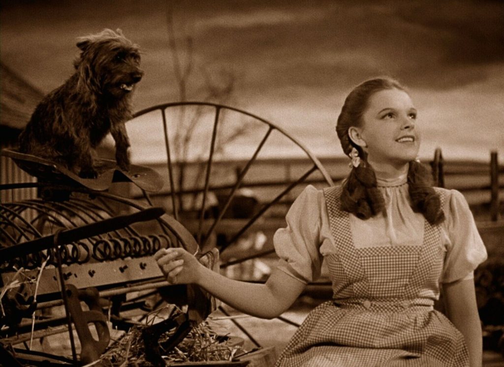
Sepia painted black and white image from “The Wizard of Oz”
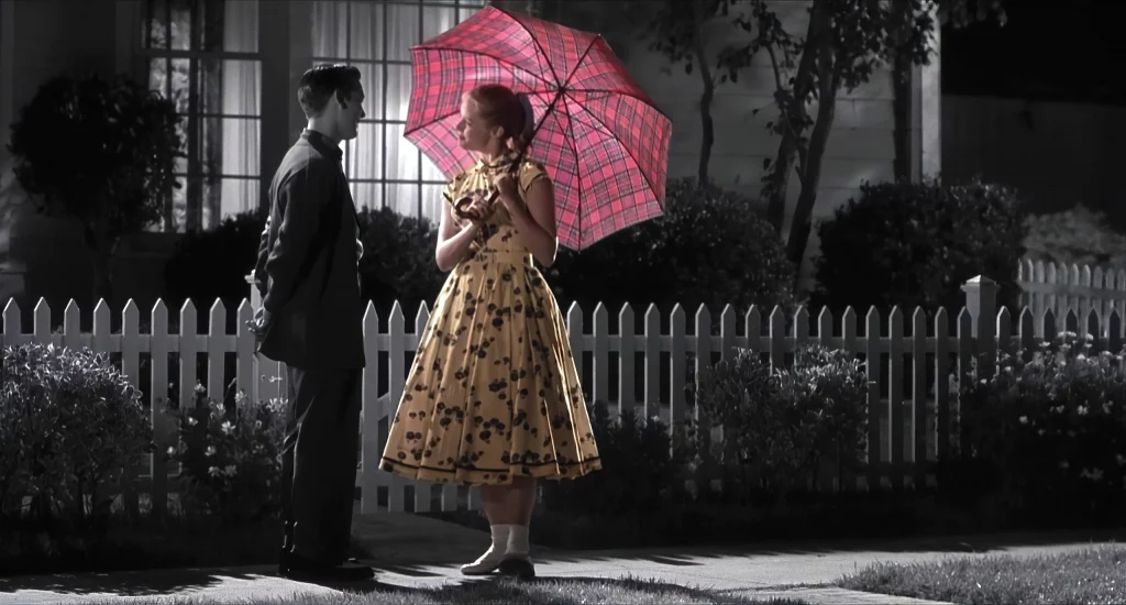
Image from the 1998 film Pleasantville, directed by Gary Ross
5. Gritty/ Textured Look
In a textured look you can often see grain. The opposite would be a silky smooth look. A gritty/textured look often has dark shadows, low mid-tones, not much clarity – instead it feels harsh and rough. Modern day cameras and lenses are so sharp and clean that people often miss the “texture” that is found in imagery that was shot on film. You can help create this textured look in the colour grade, “muddy” up the image so it’s not so clean and has more imperfections – just like real life.
Example of a gritty/ textured black and white grade
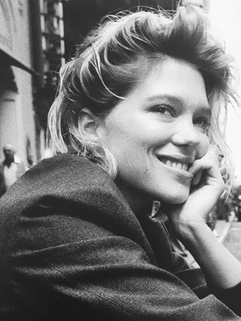
Glen Luchford’s 2013 photograph of actress Léa Seydoux for Rag & Bone New York
Conclusion
These different looks are just five examples, but there are of course infinite ways to carve and shape an image. Each of these looks have their own art history attached to them, and cinematic history, and subconscious connotations. You could grade a black and white film to look “nice” (ie. nice blacks, nice clean whites and middle greys), but if you choose a look to reflect what is happening in the story or subtext that’s when your visuals go to the next level. That’s when you really start to feel something from the image.
Check out this music video for Mick Flannery’s song Wasteland, graded in black and white by Angela Cerasi.