2 February 2023
How to make your video content look better
1. Look for interesting light to capture.
Light. Light. Light. Light. It’s all about light. Without it we would literally have no image. Look for interesting light to capture… filtered, speckled, coloured, soft, dappled, twilight, harsh, glittering and glorious light.
Capture the contrast between light and shade and this will make your image more dynamic. If the natural light is not interesting enough, cut some of it out and create shadows. Make sure your character has an eye-light – every character needs a light and a twinkle in their eye no matter how dark the scene.
If you’re filming a dark scene, light it up and put light into those shadow details then bring the exposure back down in the grade. There is no coming back from an underexposed shot and your image may break up with noise. P.S Hire a good cinematographer! She/he is worth their weight in gold.
2. Create a visual mood board of the look that you want before your start shooting.
Show your collaborators and have this on hand when you’re making decisions on costume, location and set design. Show your cinematographer and colourist so that everyone knows your intention and can aim for the same visual goal.
This planning and preparation will help make your videos look better – if you are wanting a soft colour palette then make sure your lead character or presenter is not wearing a black shirt or a bright, bold red dress.
3. Limit zooming in on full frame shots during the edit unless very necessary for the story.
Zooming in on a shot reduces the quality of that shot no matter what the source resolution.
4. Leave enough time in the filmmaking process for the final finishing.
Lock your edit (!) and let the VFX, the sound and colour department have time to craft their magic. This is a magical part (in our biased opinion) so try and avoid crazy finishing deadlines and soak up the wonderful experience of putting the icing on the cake. Great finishing will elevate your video and make it look infinitely better.
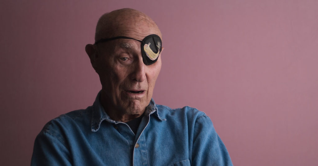
5. Stay away from cream walls as a backdrop!
Shooting a documentary interior? Try and find a wall nearby with some colour or some pattern. If it’s an interview set up, give the shot depth by having them stand in the foreground of a location with a background with objects at different heights (buildings, trees etc). If you have a stationary subject, create depth and interest by adding something in the background which can be out of focus like a coloured curtain, a vase, a sculpture, or a painting. Cream walls also make it more difficult to pull out/isolate some subject’s skin tones and it limits the separation between background and foreground. We want a good separation between background and foreground so avoid cream and go find a wall of a different colour or pattern, or if you have time and budget paint the wall!

Interview from the Peachy grade of the feature documentary Playing with Sharks.
You might also enjoy 5 Ways Colour Grading Can Enhance A Story and 5 Ways To Get the Best Out of Your Colour Grading Session.


 Prev
Prev