12th November 2024
Have you seen the acclaimed female writer/director Emerald Fennell’s latest work, Saltburn? It is the follow up film to the equally brilliant Promising Young Woman (which won her an Oscar for Best Original Screenplay) and is currently streaming on Prime Video.

Saltburn is a beautifully wicked tale of privilege and desire. Struggling to find his place at Oxford University, student Oliver Quick (Barry Keoghan) finds himself drawn into the world of the charming and aristocratic Felix Catton (Jacob Elordi), who invites him to Saltburn, his eccentric family’s sprawling estate, for a summer never to be forgotten.
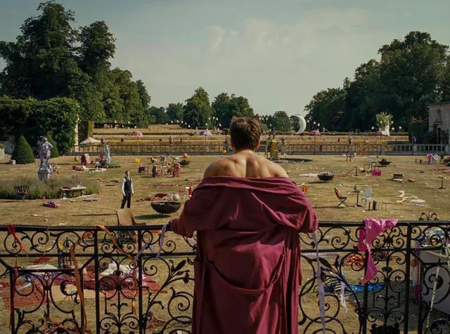
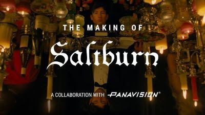
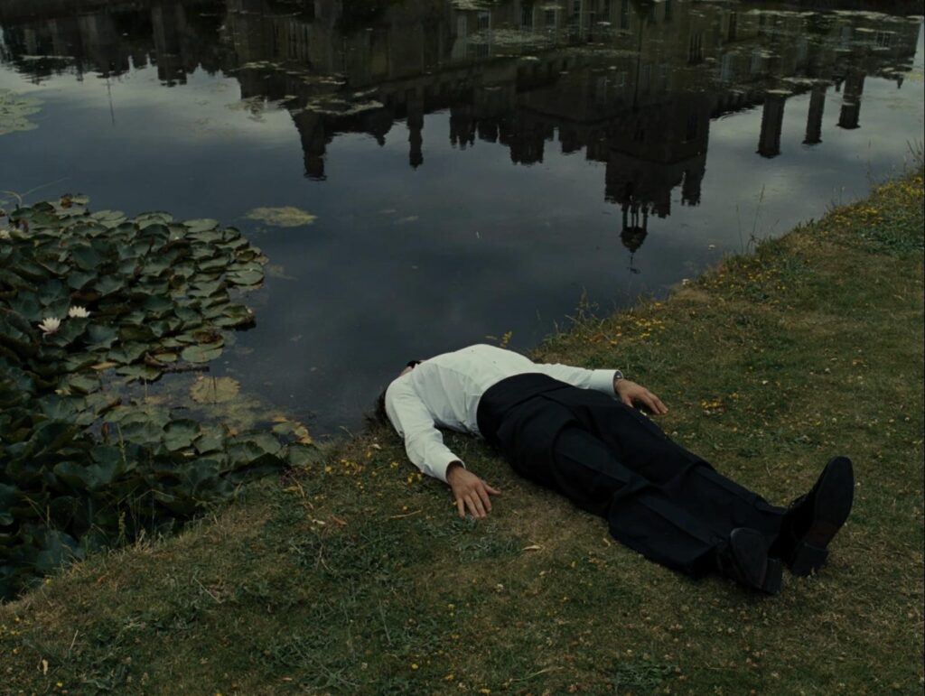
The film is a masterclass in visual language. Alongside Fennell, cinematographer Linus Sandgren captured the essence of the story with a textured, imperfect look that aligns with the film’s themes of deception and role-playing. In this 5 min video, the DOP explains his interesting collaboration with the director and the gothic vision they created.

This excellent Vanity Fair article, “How Saltburn Uses Images to Combine Gothic Beauty and Grotesque Imperfections” further unpacks the visual language of the film. We’ve extracted some key highlights below.
Highlights:
- Aesthetic Depth: Sandgren drew inspiration from classical portrait paintings, giving the film a rich, textured feel. Complemented by dramatic lighting techniques, Sandgren paid close attention to how light interacts with different textures, like velvet and silk, enhancing the richness and highlighting the contrasts between characters and settings.
- Aspect Ratio: The film is shot in the square format (1.33:1), making us focus on characters and not landscape.
- Colour grade: Inside the house, it was moody and contrasty. The world appears beautiful and lavish, but beneath the surface is a much darker reality. Outside the house it was warm, bright and saturated, making it feel like the best summer holiday ever.
- Intentional Design Imperfections: Every little detail, from the cheap shampoo bottles to the cluttered rooms, was chosen to make the world feel real. Peppered with little flaws to make the characters seem more human and add to the film’s sardonic tone.
If you’re a Prime Video subscriber, check out this exclusive 3 min interview with the DOP about the visual language of the film – so good!

This blog originally featured in our newsletter. To read the full newsletter and to subscribe to future issues, click here.
Want to learn more about a ‘filmic’ look? Peachy colourist Angela Cerasi discusses what this is and how to achieve it in this 15 min episode of her podcast, The Art of Colour Grading Podcast.
Let us know if you’ve seen Saltburn and if you enjoyed the deliciousness of the visual look as much as us. (And that scene with the song Murder on the Dancefloor!)


 Prev
Prev