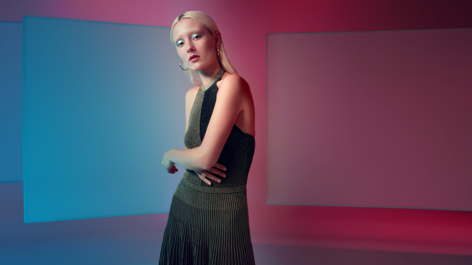
Colour grading this beauty felt like painting!
We played with tones, saturation, colour transitions within shots and shading to create a bold feel.
The video complements the print ad which was featured in Vogue Australia magazine and this was the colour inspiration.
Check out Senior Colourist Angela Cerasi’s in-depth case study of the colour grade of this commercial here.







 Prev
Prev